A few days ago, my friend texted me with horrifying news: on Saturday afternoon at the end of week one, Sanborn Library was full. Armchairs piled with jackets, laptops crammed on tables, every-alcove-occupied kind of full.
Spring term is notoriously busy, and so far, it’s lived up to expectations. As soon as the term began, I started moaning about the crowds at Collis. By day three, I shifted my schedule to hit the shortest wait for my soup or smoothie, resigned to scary-long KAF lines and struggled to find a seat in Baker Lobby at 9:30 a.m. But even as I adapted to the influx of students on campus, I thought Sanborn was safe from the crowds, forever quiet and half-empty.
A creature of habit, I spend most of my time in a few spaces: Sanborn Library, where I hide amongst the books; One Wheelock; the Current Periodicals Room; and sometimes the Tower Room. For me, Dartmouth is a series of arched reading nooks, carved wood and musty shelves. Without conscious thought, I lurk in the College’s oldest buildings term after term, and these dusty, dim spaces feel like home.
Naturally, I get cranky when my usual spots are crowded beyond belief — when I feel like I’m plowing through a shoulder-high snow bank just to cross from one side of Collis to the other. Thanks to the D-Plan, the number of students on campus fluctuates drastically from term to term, and with growing class sizes, campus infrastructure seems to burst at the seams when most of the student body is in Hanover. Of course, students bring Dartmouth to life. But in my opinion, campus loses some of its charm when we have to search desperately just to find an empty chair. A place like Sanborn demands elbow room, space to cross your legs while you work, and I’d rather not spend half an hour looking for a comfortable place to sit.
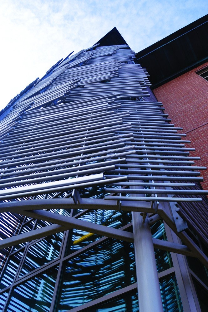
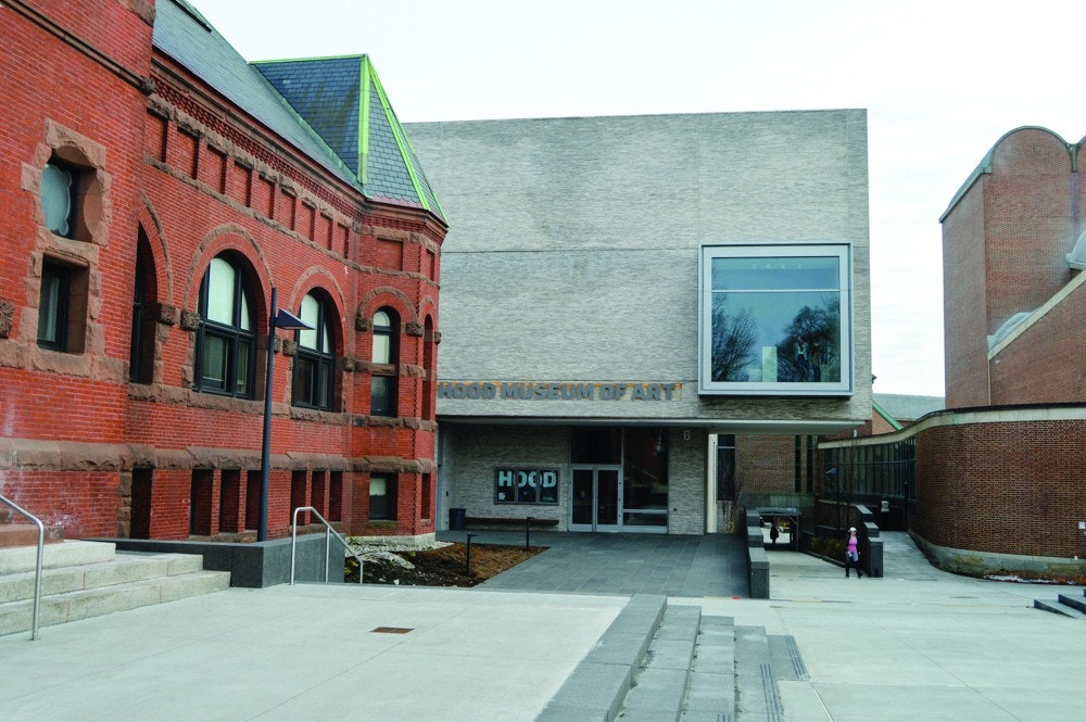
Perhaps I shouldn’t feel entitled to a well-worn couch and desk plank every time I want to crack open a book. But hey, Dartmouth spoils us. With the exception of housing, we largely get to choose the spacial experience we want on this campus. While I’ve nestled into Dartmouth’s lamp-lit quiet zones, many students only study in Berry Library. Some prefer the newer science buildings or artsy-modern spaces, like the Black Family Visual Arts Center. Dartmouth may have one of the nation’s most iconic, old-fashioned libraries, but other parts of campus are strikingly modern, from the Life Sciences Center to the recently-renovated Hood Museum of Art. Every day, we get to choose between vastly different study environments, and that is pretty inspiring.

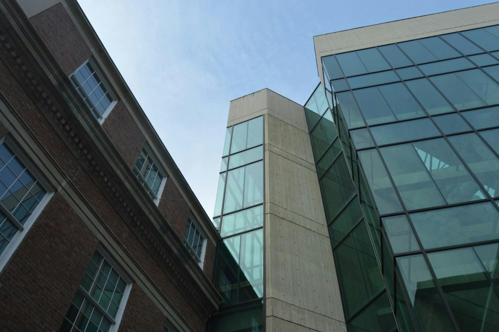
Despite my antiquarianism, the contrast between contemporary buildings and older architecture is actually my favorite part of Dartmouth. My freshman fall, I started noticing architectural clashes around campus — places where glass and brick, new and old, collide. Look up, and you can see where the ivy-clad bricks of Wilder Hall meet the soaring windows of Kresge Library, and where the sleek lines of Berry intersect with the old Baker. The 1990s expansion of Collis slips neatly into the original brickwork, and the Hood Museum’s square façade contrasts starkly with Wilson Hall’s turrets and red brick, built in the 1880s.
These juxtapositions of old and new are not only charming, but they also represent the diversity of intellectual (and aesthetic) ideas squeezed onto our small campus. Hanover might be a classic New England town, but sparks of modern design complement the brick-and-shutters standard. As Dartmouth’s student body, culture and curriculum gradually become more inclusive, it seems like campus architecture increasingly reflects this coalescence of different identities, merging historical college buildings with modern styles. Slowly but surely, the College inches away from its past, and new designs encourage a progressive mindset.

I love this contrast between buildings at Dartmouth, and I love what contrasting styles represent. So why do I still migrate to Sanborn day after day, term after term? Part of me is too lazy to think of another place to study. Another part of me simply associates Sanborn’s lamp-lit, calming atmosphere with productivity, and I fear distraction if I go anywhere else. But as I enter my sixth term on campus, I can sense myself starting to feel antsy. Especially as Dartmouth teems with students, as even my quiet study spaces grow too crowded, maybe it’s time to try something new.
According to psychological research, repetitive routines lead to feelings of boredom, especially when we always work in the same physical space. By shaking up our environment, even with small changes, we can increase our enjoyment of work and other daily habits. At Dartmouth, so many students talk about feeling confined to a small Hanover “bubble,” and by the end of 10 weeks, we feel the need to get away — to see other, more exciting parts of the world. Could we avoid this restlessness if we just explored different architectural styles around campus, incorporating new study spots into our routines?
Personally, I think it’s time to break my cycle of Collis, Sanborn, class, repeat. A brand-new, modern study space might reinvigorate my mind and inspire me to keep doing homework even as the sun climbs higher in the spring sky. In fact, it would do us all good to sit somewhere fresh each day. Although the crowds this term are frustrating, maybe they will encourage students like me to explore new corners of campus. All it takes is a few steps to experience an entirely different environment, to replace musty old furniture with fresh stone and modern lines. Swap book-filled alcoves for soaring glass windows, and campus will feel a little bigger, the world a little closer, the crowds a little thinner. A small change of space goes a long way.


