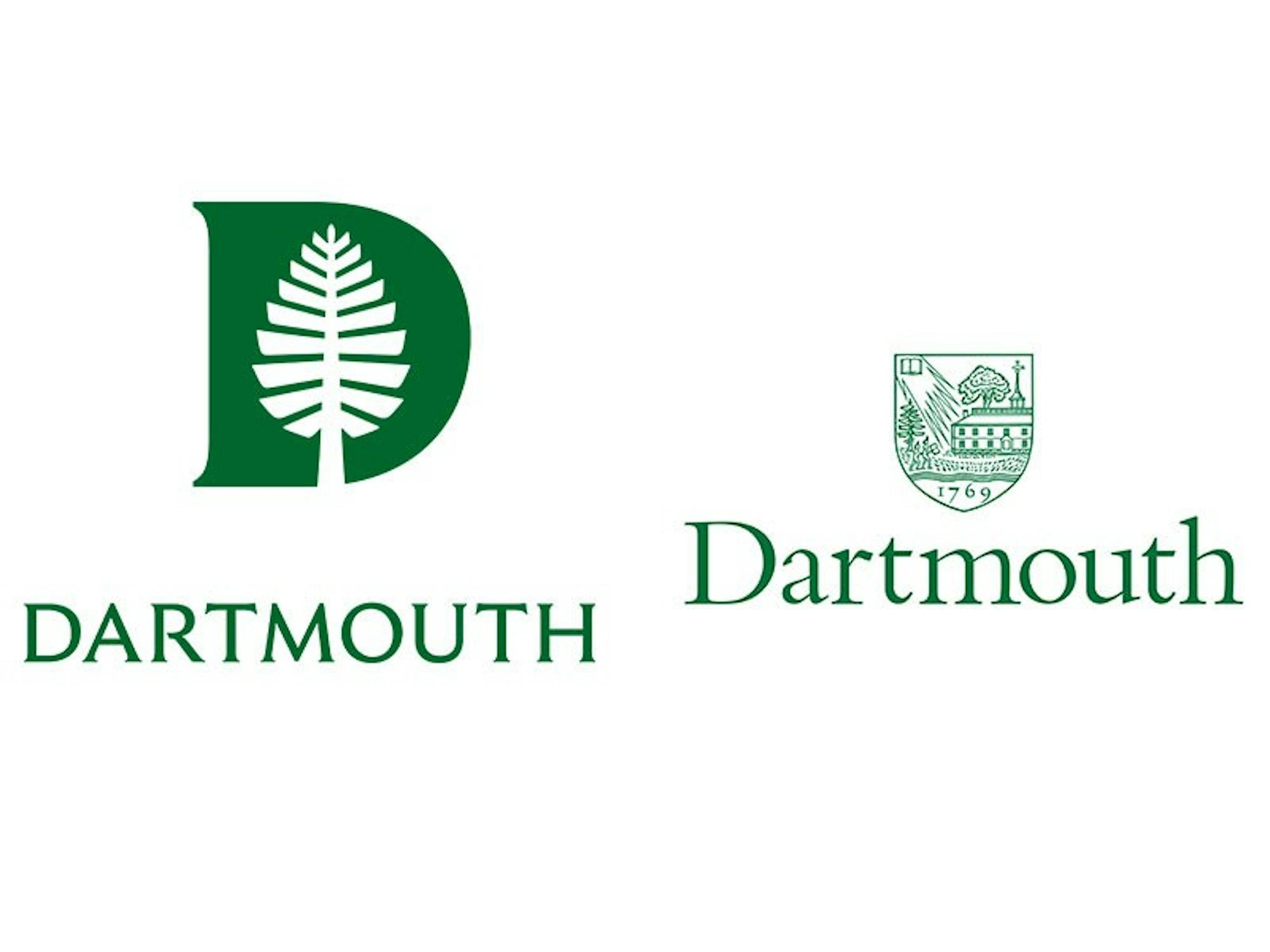
On Monday morning, the College announced a new communications framework that will form the basis for future communications from divisions across the College. In addition, the College debuted a new visual identity, including a new logo with a new font, an updated “Lone Pine” and a new “D-Pine,” with the Lone Pine placed inside of a “D.”
The goal of the new framework is to give the College a coherent narrative to use in its messaging, according to vice president for communications Justin Anderson. Dartmouth’s various departments, such as admissions and alumni outreach, will all base their future communications on the new framework, according to Anderson. While individual schools and campaigns might have previously had their own internal narratives to use, this is the first time that Dartmouth will have a single unifying strategy for communications, he said.
“I think that what we’re focusing on here, ultimately, is storytelling, and how Dartmouth tells its story in a way that is authentic and distinctive,” Anderson said.
The framework is based around five conceptual pillars meant to highlight Dartmouth’s distinguishing characteristics. The pillars are a devotion to the liberal arts; a commitment to the teacher-scholar model of education, in which faculty value both teaching and research; treating Dartmouth as a base camp from which community members venture out to explore the world; a sense of adventure; and a sense of place.
The planning process took place over a year, soliciting feedback from students, faculty and staff and other community members, Anderson said. He described the process of designing the framework as “iterative,” noting that the five pillars were not selected in a day.
“I cannot underscore enough the importance of talking to community members, because that’s where this came from,” he said. “That framework came from the community.”
In addition to the strategic framework, the College debuted a new logo with a custom-designed typeface called “Dartmouth Ruzicka,” based on the typeface used on the College’s bicentennial seal and plaque. That typeface was designed by Rudolph Ruzicka, a typeface designer who retired in Hanover. The College also debuted a redesigned Lone Pine and the D-Pine and introduced a new color palette for use in promotional materials, which maintains the traditional color “Dartmouth Green” but adds shades such as “Bonfire Red” and “River Blue.”
Anderson emphasized the importance of designing for the digital age. The newly-designed D-Pine can easily scale in size while remaining recognizable, allowing it to be used across a wide variety of contexts, he said. For example, the College uses it both as a profile picture on social media, where it is more easily recognized than the previously-used photo of Baker Tower, and as a favicon — the small logo that appears in a web browser’s address bar — for the College’s website.
During an interview, Anderson also showed conceptual art of how the new insignias could be modified, such as a rainbow-colored Lone Pine that could be used to celebrate LGBTQ+ pride. While the College is open to allowing modifications to the Lone Pine, it does not intend to allow modifications to the D-Pine or Dartmouth logo, he said.
The College’s announcement comes at the same time as it looks into several controversial initiatives, such as proposals to expand the size of the undergraduate body and to build new dormitories on College Park, potentially destroying Shattuck Observatory. Anderson acknowledged the importance of the College’s small size, calling it central to the school’s liberal arts mission and sense of place, but denied that either of the proposed initiatives would be in conflict with the five pillars if enacted. He emphasized that regardless of any increases in the student body, the College needs to expand its housing capacity.
“If sense of place is a core value, then you should not make decisions that threaten it,” Anderson said. “That doesn’t mean that you don’t build new buildings. It means that you build new buildings that honor and accentuate that sense of place.”
Anderson also denied that the College has any plans to move away from using the term “college” in its identity. College spokesperson Diana Lawrence wrote in an email statement that the College has used the single word “Dartmouth” to represent the entire institution as a wordmark since 2004.
“The undergraduate heart of this place is essential to [Dartmouth’s] identity,” vice provost of enrollment and dean of admissions Lee Coffin said.
The College’s rebranding process also comes as the admissions office prepares to debut a new admissions website, which now includes interactive features for blogging and multimedia elements like video.
Undergraduate bloggers are currently being trained to use the website, which Coffin said he hopes will be rolled out by March, when regular decision results are released. Anderson noted that the admissions office was an early adopter of the work on the new strategic framework and has created a new brochure emphasizing the five pillars.
The College collaborated with a New York-based design firm, Original Champions of Design, to create the new typeface and logos. The firm also worked with the house communities last year to design a set of crests with a unified design language, which debuted last fall, Anderson said.
Astronomy professor Ryan Hickox, who is also the West House professor and who helped lead the planning process for designing the crests, said that similar to the new College logos, the goal in designing the crests was to provide a coherent visual language that could be scaled for various uses. He also noted that the design process for the crests focused on many of the same principles as the five pillars.
“I think in a way, this was seen as something that could complement the brand redesign for Dartmouth in general,” he said.
The College will work to roll out the new logo and framework in the coming months, Anderson said. He added that while some aspects are being immediately implemented, such as using the new logo on the College’s website, other aspects, such as using up existing stocks of College letterhead and integrating the graduate schools into the new framework, will take place over the coming months.
Amanda Zhou and Veselin Nanov contributed reporting.


